
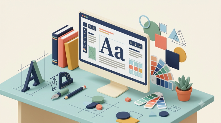
Typography is the art of arranging written language so it looks clear, balanced, and easy to understand. It affects how readers notice a headline, scan a page, follow instructions, and remember a brand. Good typographic choices can make a design feel polished, while poor choices can make useful information difficult to read.
At its core, typography combines typefaces, spacing, size, alignment, hierarchy, and contrast. These choices work together across websites, advertisements, packaging, presentations, publications, and social media. Understanding the basics gives designers and business owners a practical way to create communication that feels intentional rather than accidental.
What Is Typography?
Typography is the practice of arranging letters, words, and text to communicate information effectively. It is more than selecting a font from a menu. A designer considers how individual characters relate to one another, how lines sit together, and how the entire text block fits into the surrounding layout.
The typography meaning becomes clearer when you look at its two main jobs: readability and visual communication. Text must be comfortable to read, but its appearance can also suggest personality. A formal typeface may feel traditional, while a clean sans serif can appear modern and direct.
For anyone working in graphic design, these decisions help turn plain words into a visual system. The result can establish a recognizable style, guide attention, and support the message without competing with it.
Why Typography Matters in Design
Readers rarely experience text as isolated words. They experience headlines, paragraphs, buttons, captions, labels, and navigation as parts of one visual structure. That structure influences what they read first and how easily they move through the information.
Strong typography creates hierarchy. A large headline signals importance, a smaller subheading introduces a new idea, and comfortable body text supports longer reading. Consistent spacing then keeps the page organized.
It also affects credibility. A business website with inconsistent type sizes, cramped paragraphs, or difficult-to-read text can feel unfinished. A thoughtful system gives the same content a more reliable and professional presentation.
For businesses investing in online visibility, design should also work alongside search strategy. A good digital marketing agency can help connect branding, content, usability, and search performance rather than treating each element as a separate task.
Key Elements of Typography
Typeface and Font Choices
A typeface is the broader design of a set of characters, while a font traditionally refers to a specific style, weight, and size within that typeface. In everyday digital design, the terms are often used interchangeably.
Typography fonts may be serif, sans serif, monospace, script, display, or other styles. Each category can create a different impression, so the best choice depends on the purpose, audience, and environment.
For example, serif styles can communicate tradition or editorial sophistication, while sans serif styles often create a cleaner and more contemporary appearance. Script styles can add personality, but they usually work better for short phrases than long passages.
Size and Hierarchy
Text size helps readers understand what matters most. Headlines usually need stronger visual emphasis than supporting copy, while body text should prioritize comfortable reading.
A clear hierarchy can be created through size, weight, spacing, color, or position. The goal is not to make every heading dramatic. It is to make the relationship between different pieces of information obvious.
A well-planned hierarchy also improves scanning. Visitors can quickly identify the main topic, locate supporting sections, and decide which information deserves closer attention.
Spacing and Alignment
Letter spacing, word spacing, line height, and paragraph spacing can dramatically change readability. Text that is too tightly packed can feel tiring, while excessive spacing can break visual connections.
Alignment also shapes the page. Left alignment is often effective for longer passages because it creates a predictable starting point for each line. Centered or right-aligned text can work well for selected design elements but may be less comfortable for extended reading.
Line length matters as well. Extremely long lines can make readers lose their place, while very short lines can create excessive breaks. A balanced text width helps maintain a comfortable reading rhythm.
Contrast
Contrast helps separate levels of information. Designers can create contrast through size, weight, type style, scale, or placement.
Effective contrast should improve clarity rather than create visual noise. Too many competing styles can make a page harder to scan and weaken the intended hierarchy.
Contrast is particularly important for accessibility. Text should remain easy to distinguish from its background, and important information should not rely only on subtle visual differences.
Type in Graphic Design

Typography graphic design uses text as an active visual component rather than treating it as an afterthought. A headline might become the main visual feature of a poster, while carefully arranged supporting text explains the offer or reinforces the brand.
The strongest results come from balancing personality with function. Decorative choices can attract attention, but they still need to support the message. When text becomes difficult to understand, visual creativity has gone too far.
Designers often build a limited type system with a few complementary styles. This creates consistency across brochures, social posts, presentations, advertisements, packaging, and other brand materials.
A consistent system also saves time. Once preferred sizes, weights, spacing rules, and styles are established, designers can create new materials without starting from scratch every time.
Typography for Websites
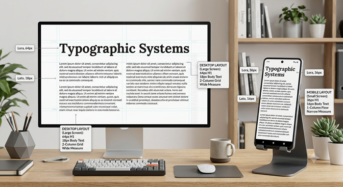
Typography web design has an additional responsibility: it must work across screen sizes, devices, and viewing conditions. A style that looks excellent on a large desktop display may feel crowded on a mobile phone.
Responsive layouts should use readable text sizes, comfortable line heights, and enough space between interactive elements. Designers also need to consider loading performance, available web fonts, and accessibility.
Typography design on a website should support scanning. Clear headings, short sections, lists, and visual breaks make lengthy information easier to navigate.
Website visitors also judge a page quickly. When text looks cramped, poorly aligned, or inconsistent, users may perceive the entire website as less trustworthy. Clean text presentation creates a stronger first impression and makes important information easier to find.
Search optimization has changed alongside user behavior and search interfaces. For useful context on the evolution of search practices, read SEO then vs SEO now before planning a modern content strategy.
How to Choose Typography for a Brand
Start with the brand personality. Ask whether the business should feel practical, premium, friendly, traditional, technical, or energetic. The answer can narrow the range of suitable type styles.
Next, consider where the text will appear. A typeface that works beautifully in a logo may not be ideal for long paragraphs. A strong brand system usually needs choices that remain useful across websites, print materials, presentations, and marketing campaigns.
Audience expectations matter too. A financial company may benefit from a restrained and highly readable system, while a creative studio may have more room for expressive styles. The important point is that the visual treatment should reinforce the brand rather than distract from it.
Limit unnecessary variety. Two complementary typefaces can often create enough contrast for an entire identity. More styles may be appropriate for specialized campaigns, but consistency should remain the priority.
Common Typography Mistakes to Avoid
One common mistake is choosing a typeface because it looks interesting without checking whether it remains readable at smaller sizes. Visual appeal matters, but function should lead the decision.
Another issue is inconsistent hierarchy. When headings, subheadings, and body copy use unrelated sizes or weights, readers have to work harder to understand the structure.
Overusing decorative fonts is another problem. Script or novelty styles can be useful for short accents, but long passages usually need a simpler treatment.
Using too many fonts can also make a design feel chaotic. Instead of adding another typeface whenever something needs emphasis, designers can often use different weights, sizes, or spacing within an existing system.
Finally, do not ignore mobile screens. Test important pages on different devices and check whether headings wrap awkwardly, paragraphs become too dense, or buttons become difficult to read and tap.
How Typography Supports SEO and User Experience
Typography does not replace keyword research, useful content, or technical SEO, but it can support the experience that surrounds them. Well-structured text helps visitors scan pages, find answers, and stay oriented.
Clear headings can also make the content structure easier for users and search systems to interpret. Good readability encourages visitors to engage with the information instead of leaving because the page feels difficult to use.
Content presentation becomes even more important as search continues to incorporate AI-powered experiences. A practical overview of google AI mode SEO can help marketers understand how search behavior is evolving.
The goal is to make valuable information easy to consume. Short paragraphs, meaningful headings, descriptive labels, and logical sections all contribute to a better experience.
A Simple Typography Checklist
Before publishing a design, check the following:
- Is the body copy comfortable to read?
- Is the heading hierarchy obvious?
- Are line lengths reasonable?
- Is there enough space between sections?
- Do the chosen styles work together?
- Does the layout remain readable on mobile?
- Is contrast strong enough for accessibility?
- Are decorative styles used selectively?
- Does the text match the brand personality?
- Does the visual system remain consistent across pages?
A short review can catch problems that are easy to miss while designing. It is especially useful when several people contribute to the same website or brand project.
Conclusion
Understanding typography gives designers and marketers a practical foundation for making text clearer and more persuasive. The right choices help readers identify priorities, move through content, and connect visual presentation with brand identity.
The best approach is not to follow every design trend. Choose type styles based on purpose, audience, readability, and the environment where the content will appear. When those fundamentals are right, even simple layouts can look polished and communicate with confidence.
Frequently Asked Questions
What is typography used for?
It organizes written content so readers can understand and navigate information easily.
What is the difference between a typeface and a font?
A typeface is the broader character design, while a font traditionally describes a specific style within it.
Why is typography important for websites?
It improves readability, hierarchy, navigation, accessibility, and the overall user experience.
How many fonts should a design use?
Most projects can work effectively with two complementary typefaces and several weights.
Does typography affect SEO?
It can indirectly support SEO by improving readability, content structure, accessibility, and user engagement.